Apple:
Apple Website The purpose of this product is to create a easily accessible and easy to understand website for a major brand in the is case Apple. The website itself is very well designed and has a simple white aesthetic making the buttons easily visible and making the page as a whole fit together a lot better.
This image is of the home screen of the website. The website currently has a new product launch planned for tomorrow. This makes the eye be immediately drawn to the image and this lets the user know immediately what is happening on the page in front of them making the image effective and the image is also a video increasing the interest to me as a user. The rest of the page is taken up by buttons for the navigation and the scroll wheel. The buttons themselves are just the text all of the button work and the striking colours of black and white make the user able to clearly see what to press on.
In terms of me using the website I found the website easy to navigate and I like the simple design of each pages and I want to be able to use this simple style for my website. When using the website I found that all of the buttons worked and the website had a lot of nice graphics that were either animated or fit into the style of the pages. For example the navigation bar used image instead of a lot of text. This provided a more visual element to the page which added more style to the page. All of the items on the page worked properly the page has a border which contains the search engine scroll bar.
The website is clearly laid out on the page and is easy to read. The website uses a colour scheme of black and white to ensure that the pages and the text on them is readable. The UX on the website has clearly had a lot of thought.
This is an image of the Ipad page on the apple website it clearly shows the product that you would want to buy and this means that the user can clearly decide what they want to do next. They ave again stick to the contrasting colours of black and white for the page as well as adding button to the top of the screen with small images. By doing this they have been able to turn the page into more of a game looking aesthetic making the website more entertaining. This is key because of Apple's wide target audience for their range of products the web browser that I have used to compare all of these different apps and websites is Google Chrome this is because it is the main website browser that I would use on a daily basis.
When I use the website on my phone the website stays similar the main things that change are that the bar at the top of the website disappear and they are now contained in a drop down list which is still easily accessible the top video is now only and image and the image is cropped. When I go to the same Ipad website page the content stays the same with the image and the text being the same with there now being a scroll bar at the top of the page with the rest of the icons.
Instagram:
Instagram the purpose of Instagram is to let users show and post their own content and have users react to it the UX is clean and simple on a pc the website looks almost identical to the phone app.
The design of the home page is very basic and easy to navigate with the simple white design with a splash of colour with the images. This makes the platform easy to navigate and increases the usability and increases the range of the target audience. The website always has a feed in the in the center of the screen. This is attracts the eye of the user meaning that they will be intrigued and want to scroll on the app. the feed is also constantly updated with the content form either from people that you have followed or the content that you have reacted positively to. Meaning that it is always changing and updating depending on your actions.
This is photo of a profile page on the platform, most of the page is taken up by the previous posts that you have posted. The rest of the page is filled up with various statistics like how many followers you have and how many people you have followed. The colour them stays that same as it was on the main page of Instagram. This improves the UX of the platform. On this page there is also a menu in the top right of the screen with settings and the buttons to let you upload new posts for people to see. Within these tools there is basic editing software and various different gimmicks that can be done like a simple greenscreen and basic visual effects. There is also a photo editing part to the tool meaning that all of the basic editing can be done from within the app making the app more appealing and easier to use for a larger age range of people.
This is the home page of the website. The home page of the website has a simple white and blue design this will improve the UX of the website. It is way to navigate and the tolls and the buttons for the different pages and linked clearly together.
The website looks and works the same on a mobile device the only change is that the phone version of the website is more compressed because of the size of the screen on a phone compared to a pc or laptop.
Pottermore Website the purpose of this website is to advertise and provide an interactive website for fans of the harry potter franchise. The website features sections with games and other interactive puzzles as well as sections with information about the author of the books and the franchise as a whole.
An example of this is the feature that they have on the website that allows them to be able to see and be sorted into the houses. These are Gryffindor hufflepuff Ravenclaw Slytherin. This is just one of the many features that the website has to increase the UEX making the website better overall.
The Website has a very strong striking image on the main page this is then followed by and ties in with the look of the website overall. The is makes the website easier to use and navigate. The website then has increased activity. Another way that the website has to capture the audience is that they can read about the certain films and there is a very well documented part of the website for each film. This lets the website have multiple uses as an information site as well as having more interactive parts to it.
The website also works on a mobile app but the screen is compressed and some of the options are compressed into drop down boxes unlike the computer. Below is an example of another more interactive page.
The website works well on Chrome the website all of the buttons work and the website uses a simple colour scheme this allows the users of the website to not be as easily distracted. The website uses simple but effective fonts and graphics to ensure that the website is not too overwhelming.
The website is well laid out allowing the page to naturally flow. There are no adverts on the page this helps with not detracting from the main subject of the page. The page uses house colours and the Harry Potter trademark text to keep synergy throughout the different pages.
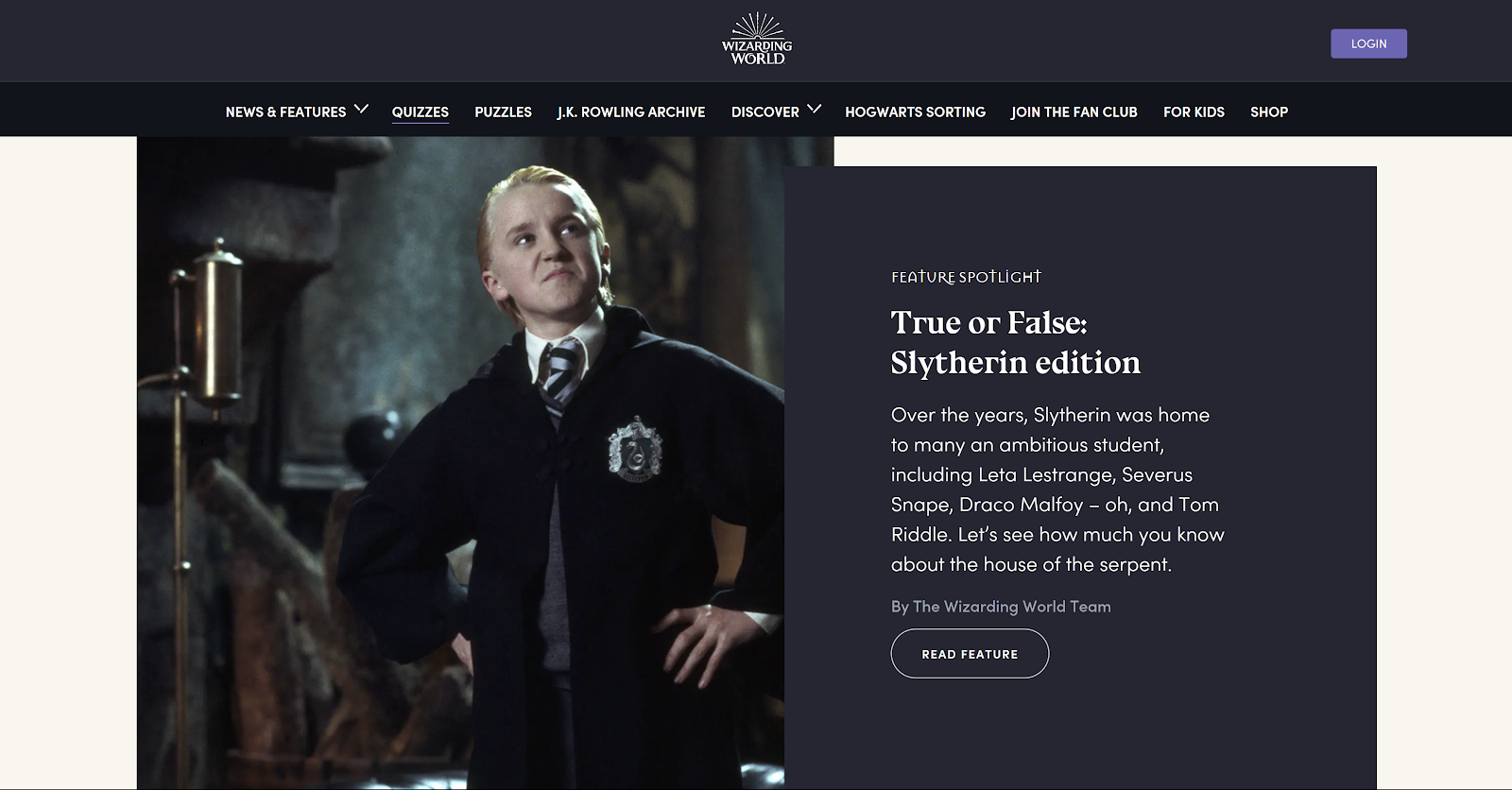
This is the page for the interactive quizzes there is a main image in the center of the page this immediately draws your eye to the center of the page. One the right of the image there is a hyperlink to the quiz this is easy to access and see there are several different quizzes on this page each with different headings.These should cover a range (4-6) of products from different styles and target audiences.


No comments:
Post a Comment