Tuesday, 24 January 2023

LO3: Folder Structure


This is the folder structure for the website the folder contains all of the used images and videos that are present on website. This means that I can easily access and then edit the various different pages of the website to make sure that they all work together.

This is the

LO2: Colour Scheme


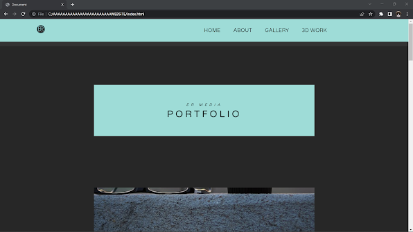
I have chosen these colours because of many different things. One of these things is that the colours are a stark contrast to each other, this means that the text will be easily readable on the page making the navigation and the ease of use of the website higher than if I picked similar colours.

Another reason for the choice of colours is that the colours are simple and they match the simple aesthetic that I am going for with the website.

Thursday, 12 January 2023

LO3: Problems And Solutions

Throughout the development process I have had a few bugs and issues that i have had to fix. Doing this has let me learn more about the code itself and how to troubleshoot CSS and HTML. 

Problem 1:


The first problem is that the text on the screen cannot be easily read because of the similar colours of the background of the page and text. I have several different options that will allow me to fix this but I have decided that I am going to change the background colour of the text box and the background colour of the pages so that they all match.

Solution 1:


This is what I have done to fix this issue. I have done 2 things I have changed the background colour of the text box which has allowed me to more easily see the text inside the box. I have also changed the background colour to white so that the page matches the rest of the pages on the website better and all of the different elements on the page.


Problem 2:


The problem with this page is that the text is too large compared to the rest of the website as well as the text being placeholder text. The titles are too large for the style that I am going for. The way that i will fix this is by changing the font sizes from rem/em to px which will allow me to make everything uniform and fit the website better.

Solution 2:


I have fixed the text and the alignment problems with the page by changing the way that the text is scaled to px instead of rem/em. This means that can control the style of the website much more easily be tailored to the style of the rest of the website. I have also removed the annoying group of links at the bottom of the page meaning that the page looks a lot cleaner.

Problem 3:


I have decided that I need to match the top of the page where the navbar is to the rest of the page. The navbar looks worse because of the same colour and there being no gap between the navbar and the rest of the page making the page look messy and detracts from the style of the website.

Solution 3:


I have been able to fix this issue by changing the background colour of the text box and the website page to the same thereby allowing me to create the gap and make the website look more finalised and closer to the style of the rest of the website.

LO3: Be Able To Create A Planned Interactive Media Product


LO4: Be Able To Test The New Interactive Media Product


Chrome:

This is the website on the Web Browser Chrome. The website has been designed to work on a variety of websites. The scaling works correctly so that the website works correctly.

This is another page of the website which is working correctly all of the hyperlinks work properly and allow the website to function as designed.


Firefox:


This is the website on mozilla firefox web browser. It is a similar browser to Chrome which means that the optimisation has been fairly basic and both pages work as intended. All of the hyperlinks work as intended allowing the website to function correctly.


Microsoft Edge:


This is the website on microsoft edge working correctly after I had to add a line of code that converted the code into a format that the browser can use. Once I had done that the website worked properly and I had no more issues.


This is the feedback that I got back from my peer testing. This allows me to be able to change and edit the website based on this feedback for example making the logo bigger and take people back to the home page.

LO4: TestPlan